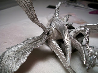
I'm trying to decide on a paint scheme for the Lord of Change. Here's a few examples
This one is displayed on the GW website. It's very clean and nice contrast in colors. I especially like the detail on the tips of the wings. The on;y reason why I don't want to paint it this scheme is that most of the LoC I see are this or a variation of it.
Two great examples from the CoolMiniOrNot.com gallery. Both of them are very creative and unique (which I think every painter aspires).
This one is a great model. I really like the bright colors of the wings and armor. The contrast against the skin is fantastic. This really makes the model "pop" and is the direction I'd like to go with my LoC.
This last one is from the cover of Wolf's Honor by Lee Lightner. The light colors and the bright metals look great for contrast. The color scheme in the background is what I plan to do for the base.
There you have it. I'm leaning towards the last one, but any input is appreciated :)
On The Table: Star Phantoms
-
What do you do when you don't feel like you've finished a project in a cool
15 years or so? Stomp your way into a full blown army full of throwback and
r...
4 weeks ago


